Styling layers
Turn a flat layer into a map that shows its story at a glance.
When a layer first lands on the map, every feature looks the same — one flat colour. Styling is how you make the map actually say something: colour each area by a number so the story jumps out, and anyone looking can see where values are high and where they're low without reading a single row of data.
What you want to do
Show the pattern, not the numbers
You have a layer with numbers in it — sales by region, population by district, fares by zone — and a table of those numbers tells you almost nothing at a glance. Your goal is a map that reads instantly: dark where it's high, light where it's low. That's a choropleth, and it's the single most useful thing you can do to turn raw data into an answer.
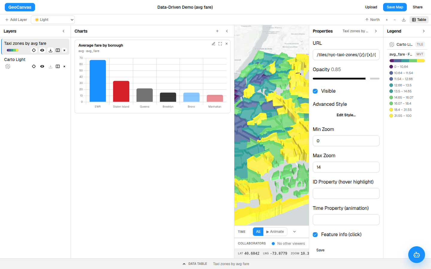
Throughout this guide we use the demo NYC Taxi Zones layer and colour it by the average taxi fare in each zone, so the expensive corners of the city light up. You can follow along on the live example map.
The example map is a shared demo, so it's read-only: restyle it all you like — the changes show on your screen but aren't saved. To keep what you make, sign in and use your own copy: your first team comes with a Demos project holding an editable copy of this very map.
Where to start
Open a layer's style
Click a layer in the Layers panel on the left to select it. Its settings appear in the Properties panel on the right, where you can nudge opacity and visibility. For the real work, click Edit Style… — that opens the styling window where every colour choice lives.
The two kinds of styling
One colour, or colour-by-the-data
You have two choices, depending on what the layer is for:
- One colour for everything. Pick a fill and outline colour and you're done. This is right for reference layers — a boundary, a set of points you just want to see on the map.
- Colour by a column. Point the style at a number in your data and GeoCanvas gives every feature a colour based on its value. This is the choropleth — the choice that makes the map tell a story.
Make the choropleth
Colour each area by its value
In the style window, open Data-driven styling and set Fill colour by to the column you care about — here, the average fare. The map repaints itself, and the legend writes itself to match. Three choices shape the result:
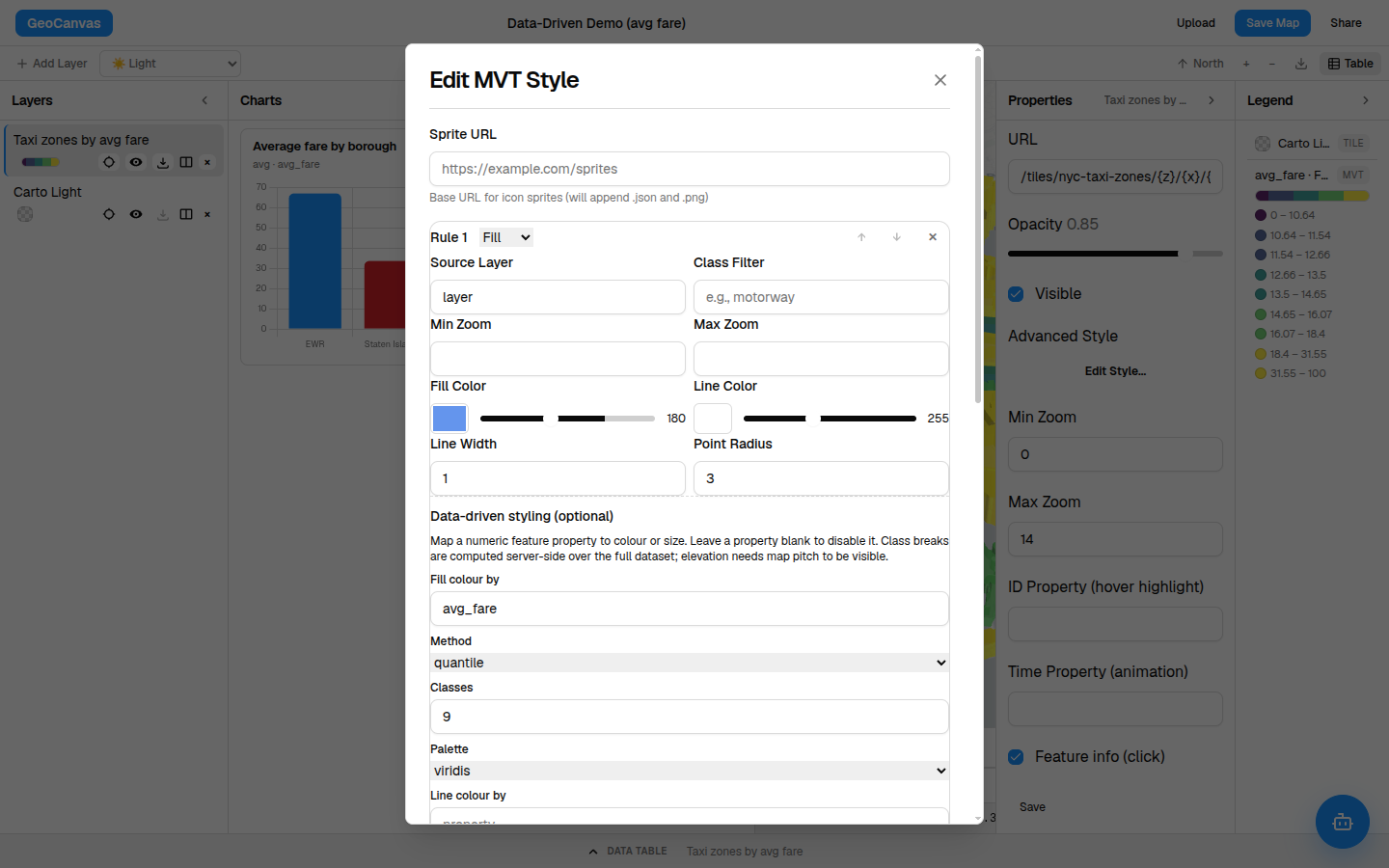
- How the colours are split. Choose even groups so each colour holds the same number of areas — the safest choice when a handful of areas are far higher than the rest (a few airport zones dwarf everywhere else, and even groups keep every colour meaningful). Even ranges splits the values into equal bands instead, and there's a setting for data that spans a huge range.
- How many colours. More steps show finer detail; fewer read more boldly. Around nine is a comfortable default.
- Which palette. Pick the colour ramp that fits — a single-hue ramp for "more is darker", a multi-colour ramp for vivid contrast.
The colours mean the same thing no matter how far you zoom in or pan around, so you can compare one part of the map to another with confidence.
Add a third dimension
Make the high values stand up
Colour is powerful, but you can go further: have the busiest areas physically rise off the map. In the same window, set Height by to a number and tilt the map — hold Ctrl and drag, or use the tilt control — and the highest-value areas stand up as 3D columns. It turns a flat picture into something you can almost feel.
Try it
Colour the taxi zones by fare
- Pick the layer. Click the taxi-zones layer in the Layers panel.
- Open the styling window. In the Properties panel, click Edit Style… and open Data-driven styling.
- Colour by the fare. Set Fill colour by to the average-fare column, choose even groups, and pick a palette you like.
- Raise it (optional). Set Height by to the same column and tilt the map to see the 3D effect.
- You’re done. The map and legend update instantly — the expensive zones are now obvious at a glance.
Your styling stays with the map, so it's exactly the same when you reopen it and when you share it. Want the map to explain those colours? That's the legend, and it's automatic. Prefer to just ask for a map in words? Try GeoChat.