Summarise and inspect your data
See the big picture in a chart, or check the rows one by one.
You've coloured your map and the shape of the story is there — now you want the numbers behind it. Two questions come up again and again: what's the overall pattern across the whole layer, and what's in this one feature? A chart answers the first at a glance; the data table answers the second, row by row.
What you want to do
The big picture, or the fine detail
Throughout this guide we use the demo NYC Taxi Zones layer — 263 neighbourhood zones, each with its average taxi fare. A chart rolls all 263 zones into one tidy summary so the pattern jumps out; the table lays every zone out so you can check the exact rows. Reach for the chart to see the trend, the table to read the details, and a single click for one feature. You can follow along on the live example map.
See the pattern
Summarise a layer with a chart
The Charts panel sits on the left, just below your layers. Click the + in its header to start a new chart, then make three quick choices:
- Which layer to summarise — here, the taxi zones.
- What to measure — a simple count of areas, or the average or total of a number like the fare.
- What to group it by — the column that becomes your bars. Group by borough and you get one bar per borough.
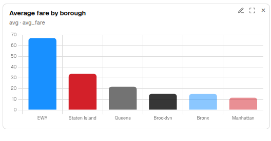
Pick a bar chart and GeoCanvas draws it instantly, tallest bar first. Group the average fare by borough and the answer is plain: fares climb from about $12 around Manhattan up to $34 on Staten Island and roughly $67 out by Newark Airport.
A chart sums up the whole layer, not just the areas on screen, so the numbers hold steady as you pan and zoom — what you read is the real total every time.
Click a bar to spotlight it
Charts and the map talk to each other. Click a bar and the areas in that group light up while the rest fade — click the Queens bar and only the Queens zones stay bright. Click it again to clear the spotlight. It works both ways: click a zone on the map and its bar lights up too, so the chart and the map always agree on what you're looking at.
Try it
Chart the average fare by borough
- Open a new chart. In the Charts panel header, click +.
- Choose the layer. Pick the taxi-zones layer and a bar chart.
- Measure the fare. Set it to show the average of the fare.
- Group by borough. Group by borough — the boroughs become the bars.
- Add it. Your chart appears, sorted high to low: Newark Airport on top, Manhattan at the bottom.
Check the rows
Read every feature in the data table
When you need the detail behind the pattern, open the data table. Click Table in the toolbar along the top and a grid slides up from the bottom of the editor — one row per feature, every column laid out plainly.
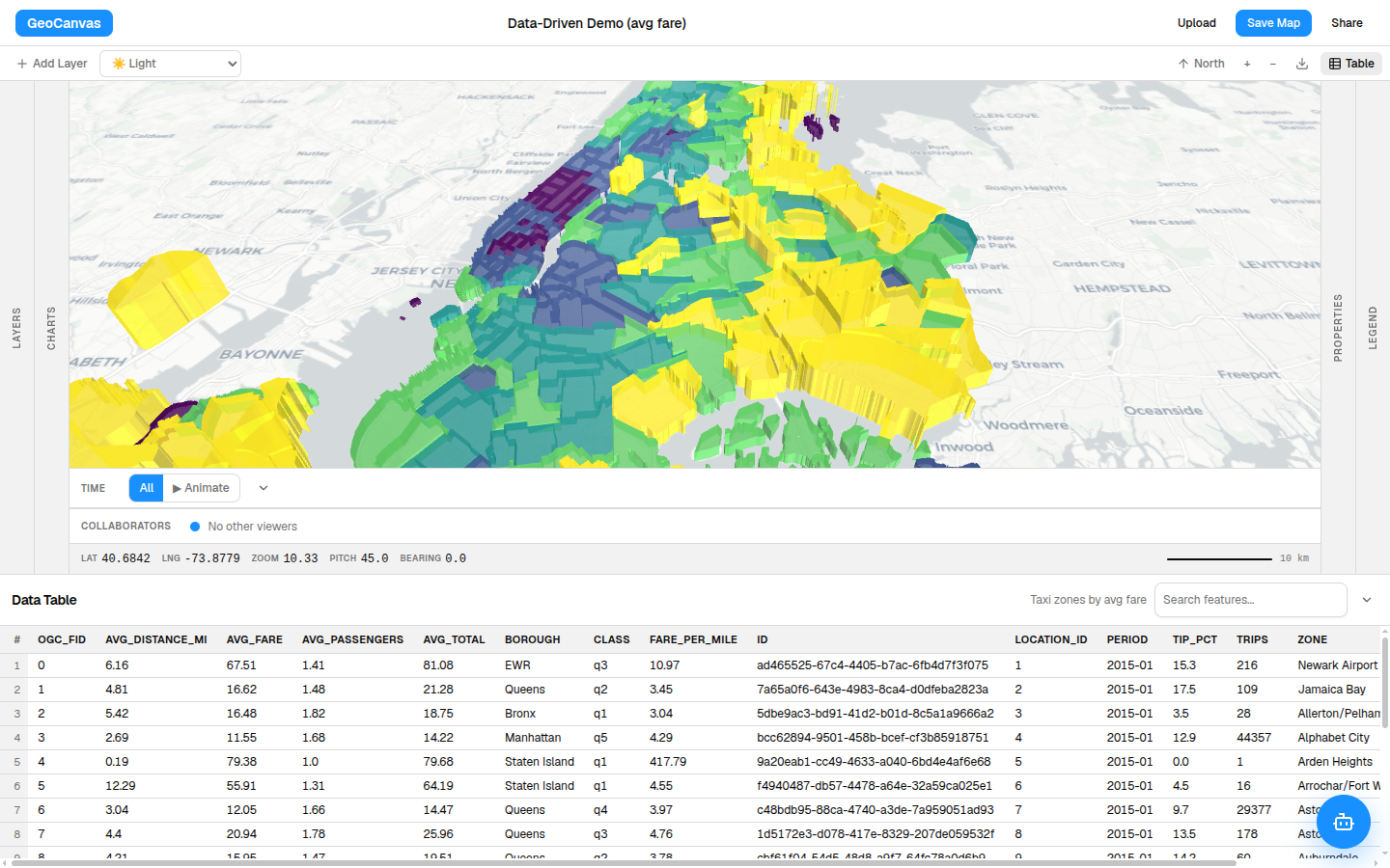
Three things make it the place to go digging:
- Sort — click a column heading to sort by it; click again to flip the order. Sort by fare and the priciest zones rise to the top, where you'll spot that the dearest spots are out-of-the-way places like Charleston and Tottenville, not Midtown.
- Search — type in the search box to filter the rows as you go. Type Airport to jump straight to Newark and the airport zones.
- Fly to a feature — click any row and the map glides over and frames that zone, so you never lose track of which row is where.
One at a time
Click a feature to pin its details
For just one feature, skip the table and click it straight on the map. A small info box pins open with that feature's details and stays put — it's not a tooltip that vanishes — so you can read it, move the map around, and it's still there. Close it with the × or click another feature to switch. It's the quickest way to answer "what's this zone?"
A chart and the table read your data; to make the map itself show those numbers in colour and height, see Styling layers. And when you want to ask a sharper question than a single chart can answer — like which exact zones top the list — write it yourself in SQL & analytics.