What is GeoCanvas?
Turn spatial data into maps that answer questions — then share them.
You've got data with a location baked into it — a spreadsheet of shops, a file of neighbourhood boundaries, a list of addresses — and a wall of rows isn't telling you much. GeoCanvas puts that data on a map in your browser so you can actually see it: spot where the highs and lows are, find the pattern hiding in the numbers, and show it to someone else. There's nothing to install — you just open it and start.
Is this for you?
If your data has a “where”, it belongs on a map
Anything with a location works: points like stores, sensors or incidents; areas like zones, districts or countries; even a plain spreadsheet that simply lists places. The thing GeoCanvas does best is take a column of numbers and make it obvious at a glance — deep colour where a value is high, pale where it's low.
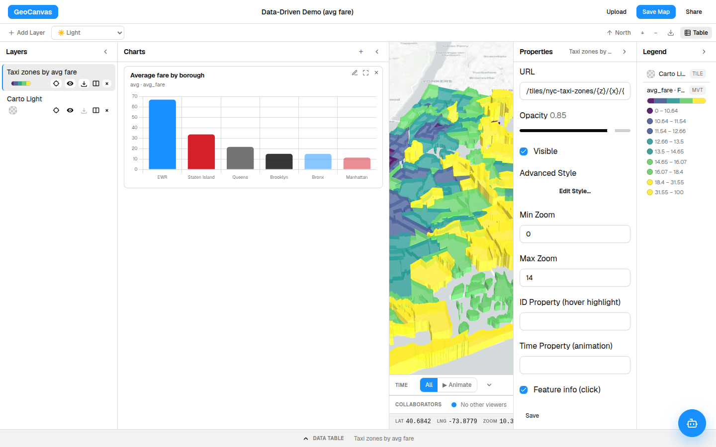
These guides follow one running example: NYC Taxi Zones, 263 neighbourhoods, each carrying its average taxi fare. As a table it's a blur of numbers. As a map, the story jumps out — fares climb from about $12 a ride in Manhattan to roughly $34 out on Staten Island and around $67 near Newark Airport. You can open the finished example map any time.
The journey
Bring it in, colour it, ask it, share it
Almost everything you do here follows the same short path — and you'll loop back through it as your questions sharpen:
- Bring your data in. Drop in a file, or pick a ready-made dataset from the catalog, and it lands on the map as a layer you can see straight away. See Add your data.
- Make it readable. Colour each area by a number — average fare, population, sales — so the map reads at a glance instead of asking you to squint at rows. See Styling layers.
- Ask it questions. Click any feature to see its details, or just type a question in plain English and let GeoChat answer it right on the map. See GeoChat.
- Share it. Turn on a link anyone can open and send it, or drop the live map straight into your own website. See Sharing maps.
You don't have to do the steps in order or all at once. Most people bring in one layer, colour it, notice something, ask a follow-up question, then tidy it up to share — going round the loop a few times.
Ask in plain English
You don't have to be technical
The best part: you can question your data just by talking to it. Open GeoChat, type something like “Which zones have the highest average fares?”, and it highlights the answer on the map and lays it out beside it — no spreadsheets, no formulas to learn.
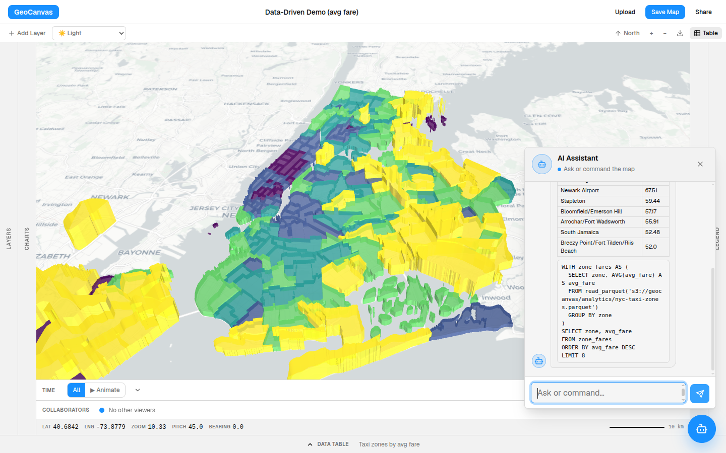
The taxi answer is a small surprise: the priciest rides aren't in the busy core at all. They're far-flung corners like Charleston and Tottenville out on the edge of Staten Island, with the airport runs close behind — exactly the kind of thing you'd never catch by scrolling a table.
Where to start
Start here
The quickest way to get the feel of GeoCanvas is to build the taxi-zone map yourself, start to finish.
- Create your first map — the guided walkthrough, from an empty canvas to a shareable map in minutes.
- Add your data — bring your own file, or browse the catalog of ready-made datasets.
- Styling layers — turn a flat layer into a map that tells its story.
- GeoChat — ask questions in plain English and watch the map answer.