Help viewers read your colours
An automatic key so your map explains itself.
You've coloured your map so the story jumps out — but a colour only means something if people know what it stands for. A legend is that little key: the guide that says "darker means pricier." The good news is you never draw one by hand. GeoCanvas builds the legend automatically from the way you styled your layer, so your map explains itself to everyone who opens it.
Where to find it
The legend builds itself
The moment you colour a layer by its data, a legend appears on the right of the editor, next to the Layers and Properties panels. You don't add it or fill it in — it reads your styling and lays out the colours for you. The same compact key also sits beside the layer in the Layers panel as a small strip of colour, so you can read a layer's meaning at a glance without opening anything.
How to read it
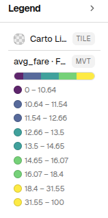
Reading the taxi map
On our demo map the taxi zones are coloured by their average fare, and the legend shows a ribbon of colour split into bands. Each band is labelled with the fare range it covers, and the rule is simple: lighter is cheaper, darker is pricier. The pale zones sit around $12 — the typical Manhattan fare — and the colour deepens as fares climb, past about $34 on Staten Island, up to the priciest, out-of-the-way corners like Charleston and Tottenville, with the very top of the range around $67 near Newark Airport. One look at the legend tells you which end of that range any zone falls in.
Follow along on the live example map.
Always current
It updates the moment you restyle
The legend is never out of date because you never maintain it. Change the palette or the way the colours split and the bands re-label themselves instantly. Reorder your layers and the legend reorders to match. Hide a layer and its entry fades out. Whatever you do in the style window, the legend simply follows.
The legend is the fastest way to check your colours are working: if every zone landed in the same shade, something's off in how you coloured the layer — and the bands will show it at once.
It travels with the map
Shared and embedded maps keep their key
Because the legend is part of the map and not something pasted on afterwards, it goes wherever the map goes. When you share a link or embed the map in your own site, the colour key travels with it — so the people you send it to can read the map without a word of explanation from you.
A legend is only ever as clear as the styling behind it. To choose the colours and the way they split — the very choices the legend then explains — head to Styling layers.